I believe that the essence of a book illustrator’s profession lies in the ability to keenly perceive the unique character of a given text — its tempo and timbre. Books can be purely figurative, books of action, books of atmosphere, books that are novels of the soul — often in various combinations of these and other qualities.
There is being — that is the first layer, so to speak. Then comes the word. Illustration is the third layer.
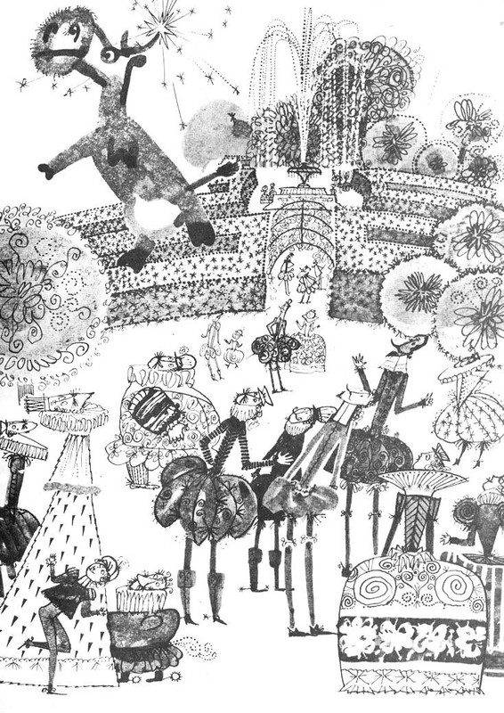
Illustrations from “Mary Poppins”, 1978
Words are not as universal as images; they depend on translation and on time. But the Victory of Samothrace requires no translation, and its impact remains independent.
Strictly speaking, the word illustrator comes from Latin and means “one who illuminates.” An illustrator must also possess the ability to impersonate, to conceal oneself, like an actor performing different roles.
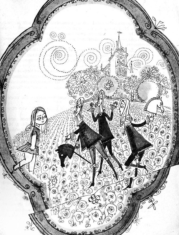
Illustrations from “Mary Poppins”, 1978
Often, illustrators as artists are dissatisfied with the role that in German is called Gebrauchs — applied art. And artists such as Dmitry Bisti, for instance, have, in my view, offered their own commentary — an ironic illumination of The Song of Roland.
Like a lathe operator tuning his machine to a new mode, the illustrator must adjust his psyche, resetting it each time he begins a new book.
It is not merely a matter of changing technique. One must first determine the very purpose of illustration. Here, a perceptive and intelligent editor can and should help. For me, such an editor has been A. Saprygina from Detskaya literatura Publisher, with whom I’ve worked for nearly a decade.
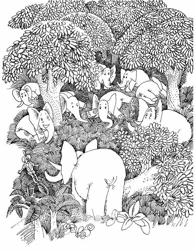
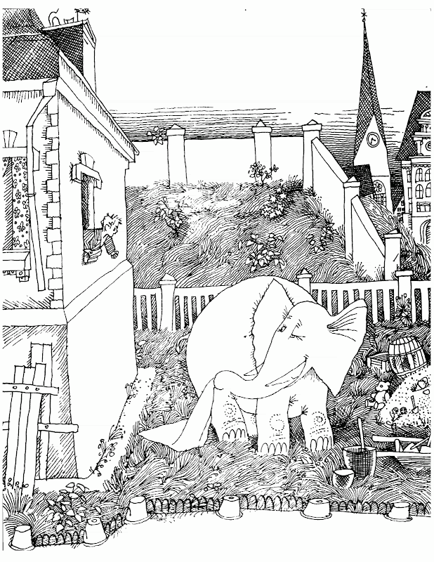
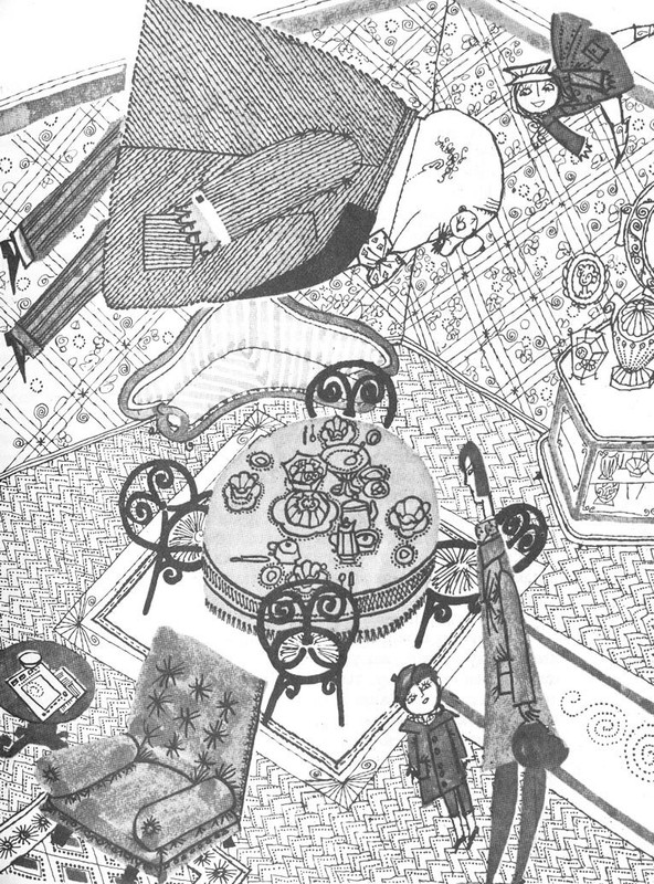
Illustrations from “Listen, Elephant”, 1969
Sometimes I define the visual style myself.
At times, the books are deceptively complex, and collaboration becomes essential — as it was with my illustrations for Carroll and Swift.
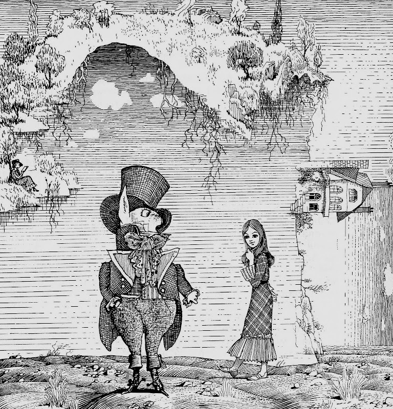
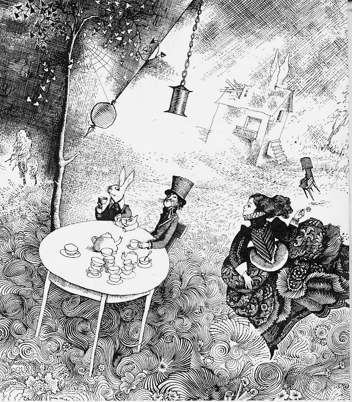
I have illustrated Alice’s Adventures in Wonderland three times. About ten years ago, it was the version translated by B. Zakhoder; later came Through the Looking-Glass, translated by V. Orel. Now I am once again working on Alice, in Orel’s translation — a color edition.
As is well known, Carroll wrote his book about his ten-year-old neighbor. Less well known is that the first illustrator of Alice, Sir Tenniel, in turn drew his own ten-year-old neighbor. Remaining true to this tradition, I drew my own neighbor, Lenochka P.
One challenge was thus resolved.
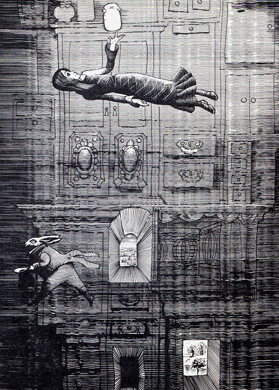
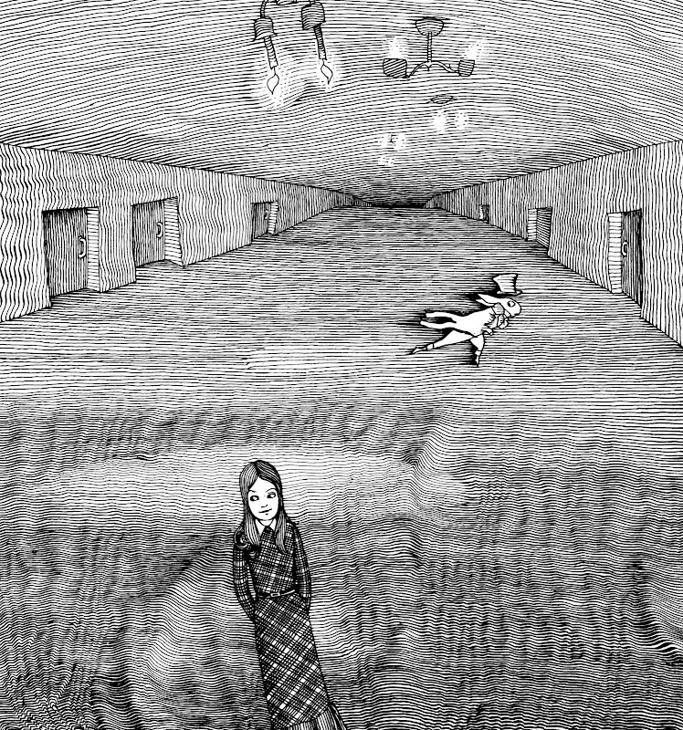
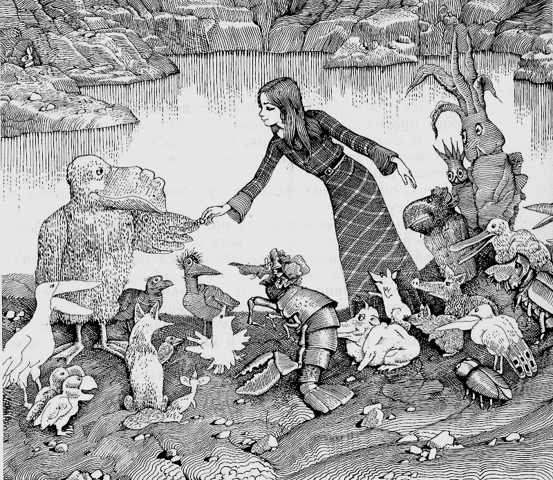
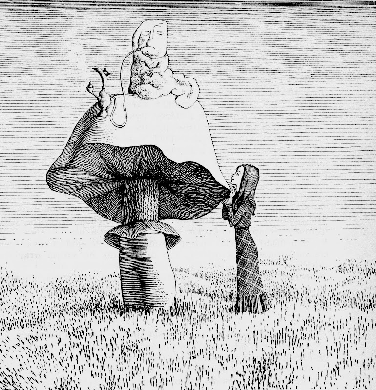
Illustrations from “Alice’s Adventures in Wonderland”, 1974
Carroll’s book, in my opinion, is not a fairy tale. A fairy tale is devoid of paradox; it has a firm ethical foundation, and its plot is of the wandering kind. First, Alice is not a folk tale but rather a folkloric stylization.
Second, it is a kind of novel about the life of paradoxes.
Third, it may be seen as a parody by a traditional mathematician — Carroll — of the principles of new non-Euclidean mathematics, which, as we know, Professor Dodgson regarded with irony (though, as mathematicians have told me, the parody inadvertently grew into its opposite — an affirmation of the very ideas it mocked). I did not feel this aspect strongly, being unfamiliar with higher mathematics, and took it simply on faith.
Fourth, the book is written in the key of a visionary perception of existence — as if in a dream.
All of this had to be considered and reflected in the drawings, keeping all four aspects in mind.
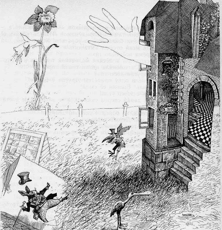
Illustrations from “Alice’s Adventures in Wonderland”, 1974
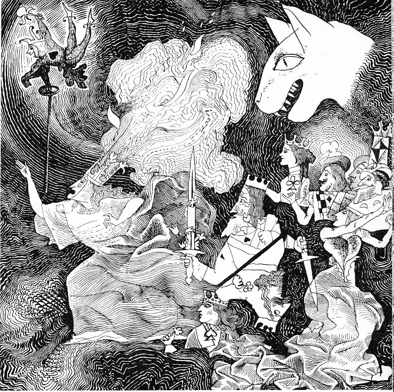
I believe that a drawing, even in its inception, cannot be constructed.
“An artistic image is a spontaneously arising conception, possessing extraordinary clarity. How an image is born — no one knows. It is not observation, not memory, not invention, nor a mechanical fusion of parts. Heuristic thinking is born of longing. Longing is an unformulated goal.
Logic is thinking within the limits of what has already been discovered — that is, ‘thinking in hindsight,’” wrote the Soviet author M. Ancharov in his story Soda-Sun.
I can only work when completely isolated from the pressures of life. In fact, I sealed my studio from light, closing all the windows and almost ceasing communication altogether, and lay in a half-sleeping, half-waking state for days and weeks, watching strange shapes rise one after another from a reservoir that I suppose is what we call the subconscious. My friends still joke about my “tin can,” as they called my studio. I know a respected artist who, every morning, goes to the market just to pick a quarrel, to get himself worked up — and that’s how he finds his working mood. Everyone has their own method.
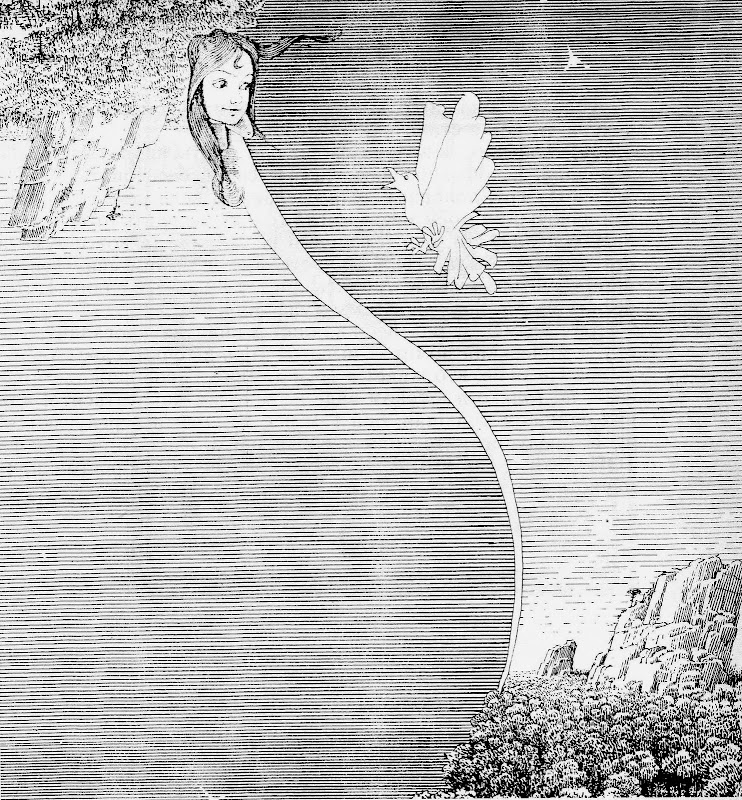
Illustration from “Alice’s Adventures in Wonderland”, 1974
I worked on the book for about a year and a half, though for nearly a year I didn’t pick up a pencil — only “rehearsed” the drawings in my mind.
“In acquiring skill, we lose the instinct,” said Kipling. He was right: working solely out of professional skill is not a serious approach to art, for the professional level of graphic artists today is high. That is both a great deal — and already very little.
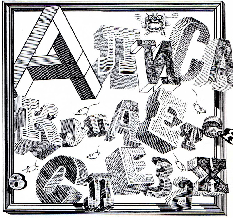
I decided to use slightly distorted space and three-dimensional lettering in a three-dimensional composition. I had first experimented with this type of font about ten years earlier in Alice in Wonderland.
For such a mischievous book, this whimsical and intricate design seemed entirely fitting. I was told, however, that such complexity might be too much for a child’s eye. That is not true. Children are naturally inquisitive and love to solve puzzles. Judging by the letters that came to the publisher, they accepted the drawings wholeheartedly. That was gratifying.
Illustrations from “Alice’s Adventures in Wonderland”, 1974
Swift, however, proved more difficult.
At the outset, the editor and I decided that visionary whims would not suffice. Swift challenges the artist not so much to feel the book as to comprehend it — to think while feeling, and to feel while thinking. These seem incompatible, yet they must be united; otherwise, the result will be mechanical.
How does one unite feeling and thought? That is an innate gift of the artist — it cannot be taught.
How should we perceive the Lilliputians: as a social or an ethical phenomenon?
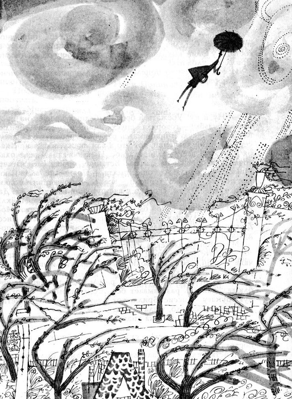
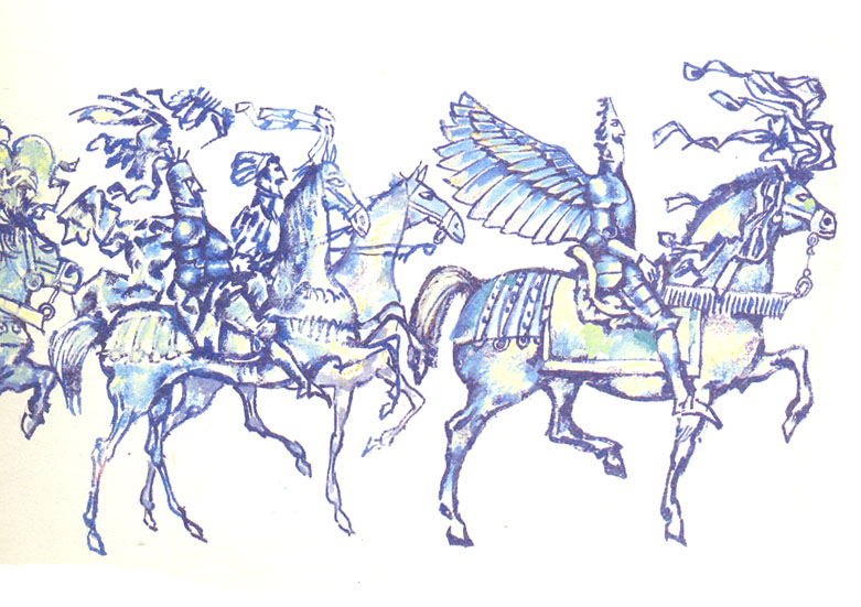
Illustrations from “Gulliver’s Travels”, 1992
If we follow Swift literally, the result will be, and must be, no more than a political pamphlet on early eighteenth-century England.
Let us take the pamphlet approach as a starting point and first look closely at the king. Apart from his title, he behaves, frankly, like a typical “great man” of earthly history. He adapts the power that falls into his hands to his own ends. He sustains it at his own expense, not that of his subjects.
To a pacifist, he is repugnant. After all, Blefuscu, as I understand it, is Lilliput’s trading rival — and, as so often happens on earth, behind the blunt or sharp end looms a purse. When money is at stake, any excuse will do for hating one’s neighbor.
Do the people themselves behave like “Lilliputians” — ridiculous and petty? A careful reading suggests otherwise. They are skillful and brave — after all, they did not fear the giant, but bound him and made him accept their way of life. They took a risk, a mortal one at that. So they are not “Lilliputians,” but rather fine little people — simply very small. In every respect but size, they are no different from Gulliver.
Illustrations from “Gulliver’s Travels”, 1992
The editor suggested that I approach the illustrations for Swift as a realistic work with a touch of fantasy.
The Lilliputians, she said, should be depicted sympathetically, with full seriousness and attention to individuality — simply miniature versions of ordinary people in costumes:
a) either extremely general, common to many times and peoples;
b) or specifically eighteenth-century European;
c) or exotic, fairytale-like;
d) or, so to speak, “compote” costumes — of all times and peoples mixed together.
Here is what we concluded:
a) truly universal costumes do not exist, and generalization would blur Swift’s intent;
b) to portray them in European dress would be unfair to Europeans;
c) exotic costumes would make it look like “long, long ago, in a kingdom far away…” and Swift’s idea would dissolve even more than through generalization.
The target of his irony is timeless, yet precise — it is all of humankind in every age.
So what was to be done?
“The dean was somewhat bilious,” as Swift once wrote of himself.
So we settled — perhaps somewhat mechanically, yet most faithfully to Swift — on a deliberately mixed approach.

Illustrations from “Gulliver’s Travels”, 1992
The costumes were somehow resolved. But here’s an unexpected conclusion: the Lilliputian, in that pejorative sense of the word as we’ve grown used to understanding it, doesn’t really exist. I couldn’t quite make the ends meet. Or perhaps Swift couldn’t? Maybe he wove a venomous arabesque with no resolution, gleefully trampling the English court in the process? After all, he had his own personal scores to settle with that court. Perhaps he left all his future “interpreters” to puzzle over what exactly he meant by this book?
Perhaps one could only judge humanity — Lilliput — so fiercely, as Swift did, from very lofty, even exalted positions? From moral — or, as some would say, global — standpoints?
Essentially, this is a book about man. Is he insignificant, or great? Does his existence have meaning? Can life itself be defined in any single, all-encompassing way?
And I think Swift himself is not easy to define unambiguously.


Illustrations from “Gulliver’s Travels”, 1992
I began making drawings, finding solutions from one to the next — each one suited precisely to that particular image — without being guided by a single, predetermined scheme. (At first I had one: Gulliver as the norm, everything else as anomalies. We later rejected it as a shallow approach.) I completely eliminated any purely entertaining purpose in the drawings — each had to have its own semantic core.
After all those discussions, I pinned a note above my desk that read:
not too grotesque,
not too serious,
not too extravagant,
not too historical.
That became my guiding principle.
I knew that some artists treat words with irony. I think there’s a bit of affectation in that — but also a touch of helplessness before the word, like a fox before the grapes.
In the ancient world, rhetoric was among the first school disciplines — they understood how serious this bridge between people — the word — truly is.
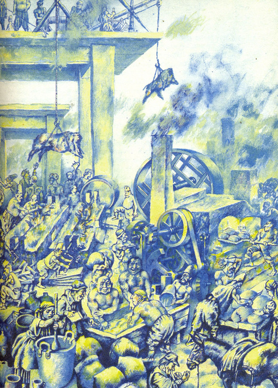
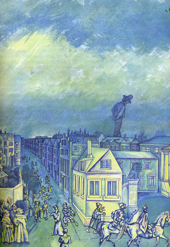
In the first illustration, where Gulliver lies bound, I covered him with countless Lilliputians, like mosquitoes swarming a tree stump — he’s almost invisible beneath them. The little people have swallowed up the big one. And I think the drawing became more complete for it. There are hundreds of Lilliputians — and I had no right to make any of them a mere extra, or, as I was advised, a puppet. On Gulliver writhed a well-oiled state mechanism, where every element was an autonomous unit.
What is Gulliver to this world? A natural phenomenon — like snow, hail, rain, slanting rain: “I shall pass by, as slanting rain passes.” These sad lines, suddenly remembered, defined the composition of that illustration.
When the little people bid farewell to Gulliver, they are subdued and somewhat dejected — for something bright, even magical, a lofty natural phenomenon — the Mountain-Man — is leaving their lives.
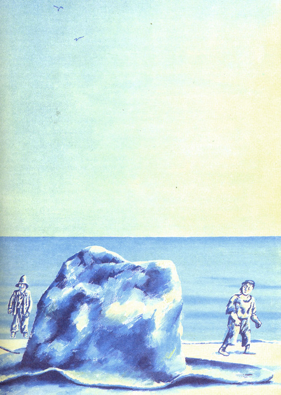
And the Mountain-Man, on the next spread, is tiny — in a tiny boat — amidst an immense expanse, where there are no longer giants nor Lilliputians: “And time, onward — be brave, old heart…”
Such solutions are rather common directorial choices. How well they worked visually — I wouldn’t dare to judge. Essentially, this article is about my good intentions.
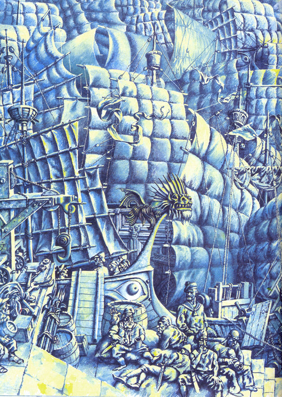
The book was in color — my first color book. Illustrations for Swift cannot be painted; they must be sculpted with color. For this is not a book of states, but a book of forms.
I tried to design the layout as a continuous flow, where the illustrations are connected not by text but directly to one another — like a stream, from beginning to end. In my opinion, that stream turned out somewhat weak.
My task is depiction. “Depict, artist — don’t waste words.”
But since I’ve already depicted it, I may as well speak. A bit long-winded, perhaps — but don’t hold it against me: when you work on a book for a long time, you can’t help thinking about it a lot.

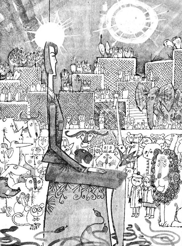
Illustrations from “Gulliver’s Travels”, 1992