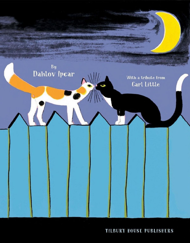
Author: Dahlov Ipcar
Illustrator: Dahlov Ipcar
Year: 1969
Publisher: Doubleday
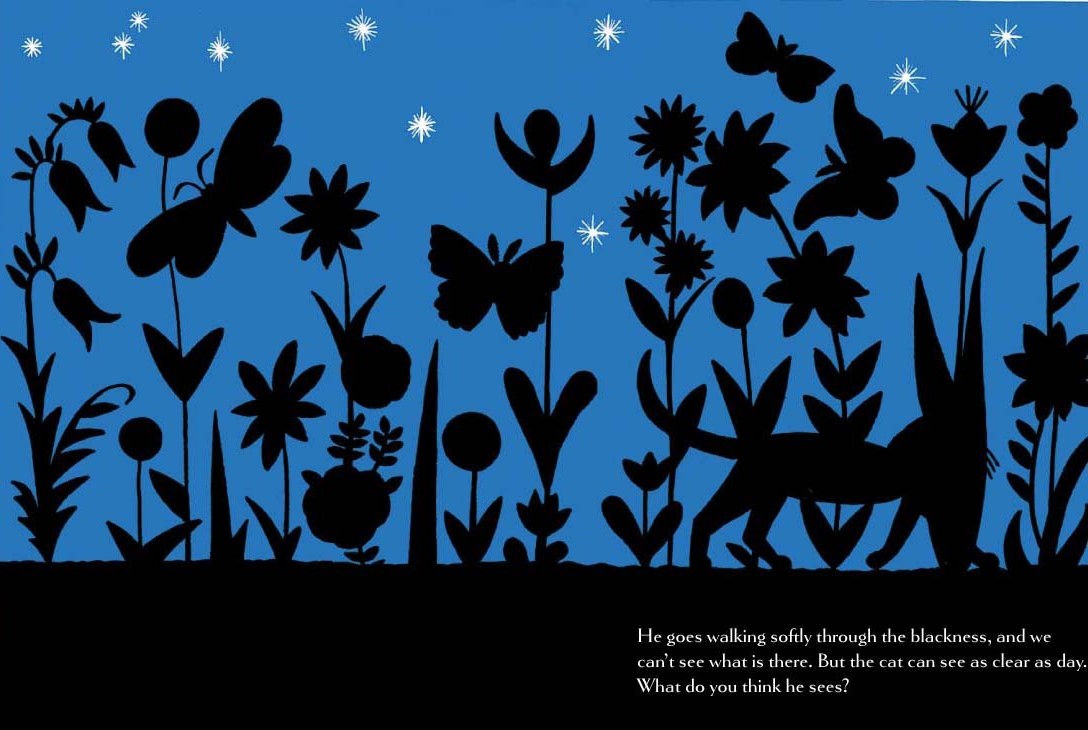
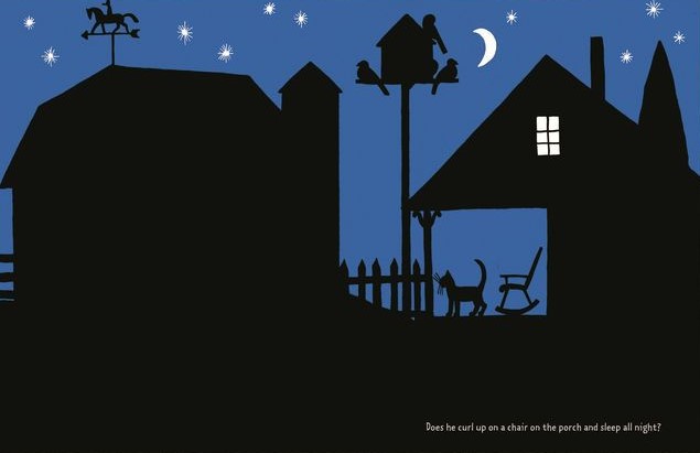
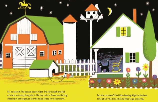
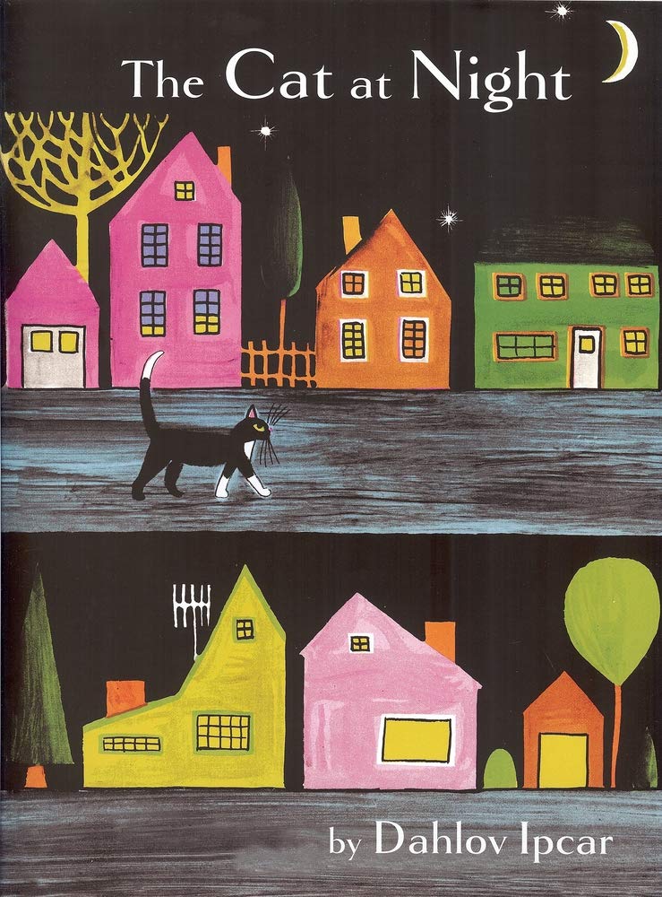 In this book, Ipcar plays with contrast in a very direct, visual way. The cat moves through the dark, and each spread shifts between deep nighttime tones and bright, fully colored scenes that suggest what he perceives. The alternation feels almost rhythmic — quiet, shadowed pages followed by sudden bursts of color — and that back-and-forth creates the book’s whole atmosphere.
Ipcar’s style is instantly recognizable here: clear outlines, strong shapes, and colors arranged in bold, almost graphic compositions. Even in the darker pages, the forms stay crisp, and when the color returns, it fills the scene with a kind of steady, confident brightness she’s known for.
The book’s idea — seeing the night from a cat’s point of view — is carried mostly through these visual shifts. Instead of relying on dramatic action, the story moves through a series of places the cat passes: farms, woods, quiet roads, and city corners. Each location becomes a chance for Ipcar to play with pattern, color, and contrast, turning a simple nighttime walk into a sequence of strong, memorable images.


.jpg)
.jpg)
